Case Studies
How Brightland Turns Pantry Essentials Into a Premium, Giftable Brand Experience
Brightland pairs artistic packaging with smart Shopify merchandising: insight-rich email capture, studio photography, simple copy, recipe pairing guides, and occasion-based gift collections.


Brightland is one of those Shopify brands we keep coming back to. They don't run flashy promotions or overload the homepage with offers. Instead their entire experience feels crafted and well considered. The packaging, the photography, the copy, and the way products are grouped for real shopping intent. It feels like a brand that understands that it is not just selling olive oil or vinegar but a better version of everyday cooking and gifting.
We studied their storefront to pull out DTC tactics that hold up beyond the pantry category. Each pattern below is something you can apply on your own Shopify site.
Email capture that sells, learns, and segments in one step
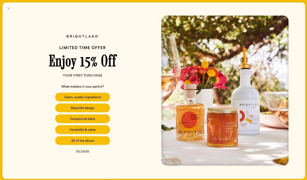
Most brands treat the welcome offer as a discount trade. Brightland treats it as a conversation.
The popup offers 15% off a first purchase, which is standard. What is not standard is the question underneath it: What matters in your pantry? Shoppers choose from clean quality ingredients, beautiful design, exceptional taste, versatility and value, or all of the above.
That single interaction does three jobs at once. It incentivizes a first purchase. It captures preference data you can use for segmentation and content. Also for visitors who never buy, it still records what they care about. That powers rich consumer insight not just sales, that can manifest into product strategy, catalog strategy and conversion rate optimization.
The email capture also frames the brand's values immediately. Brightland is not presenting olive oil as a cooking commodity. It is presenting a product that solves a desire: a pantry that feels intentional, beautiful, and trustworthy.
Packaging artistry backed by studio-grade photography
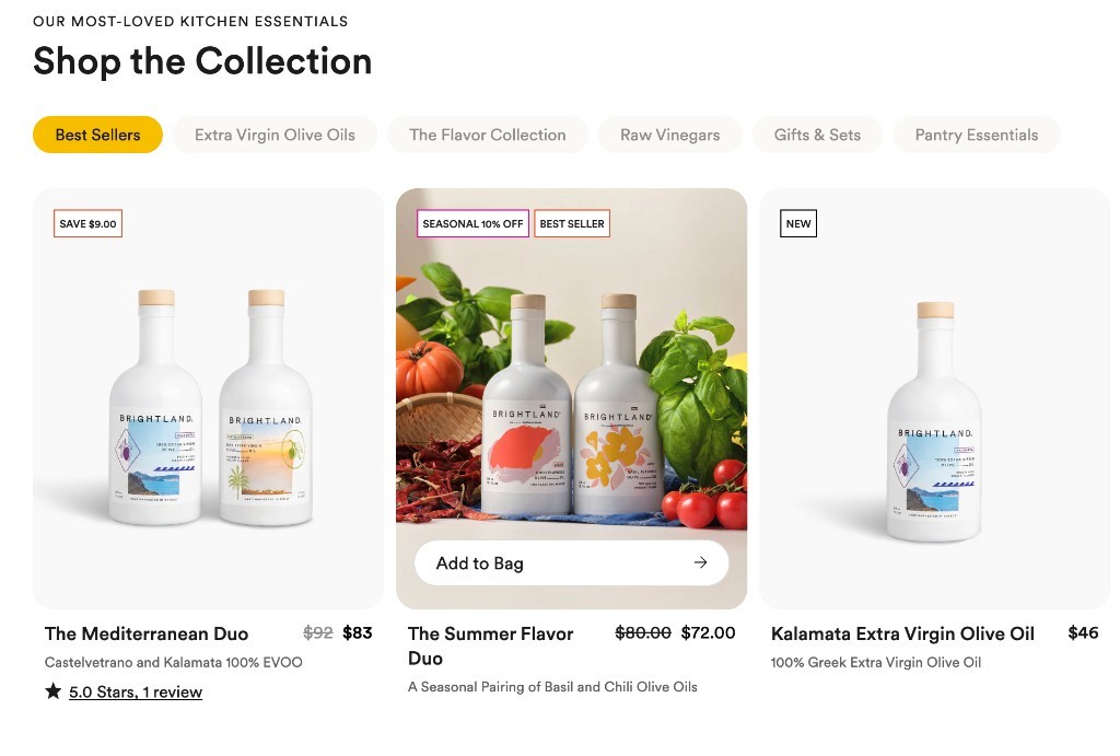
Brightland invests heavily in packaging. Their bottles are objects people want on a counter but many brands stop there.
Brightland follows through with photography that complements their product packaging and brings their assortment to life. Products appear with curated, high-quality environments: outdoor tables, fresh flowers, wine glasses, and salads in progress. The imagery matches the packaging standard instead of dropping to generic white-background shots right after the unboxing moment. This may seem like a simple observation but many brands miss the full opportunity of leveraging their packaging to drive sales by stopping at just the main image.
Simple copy that lets the page breathe
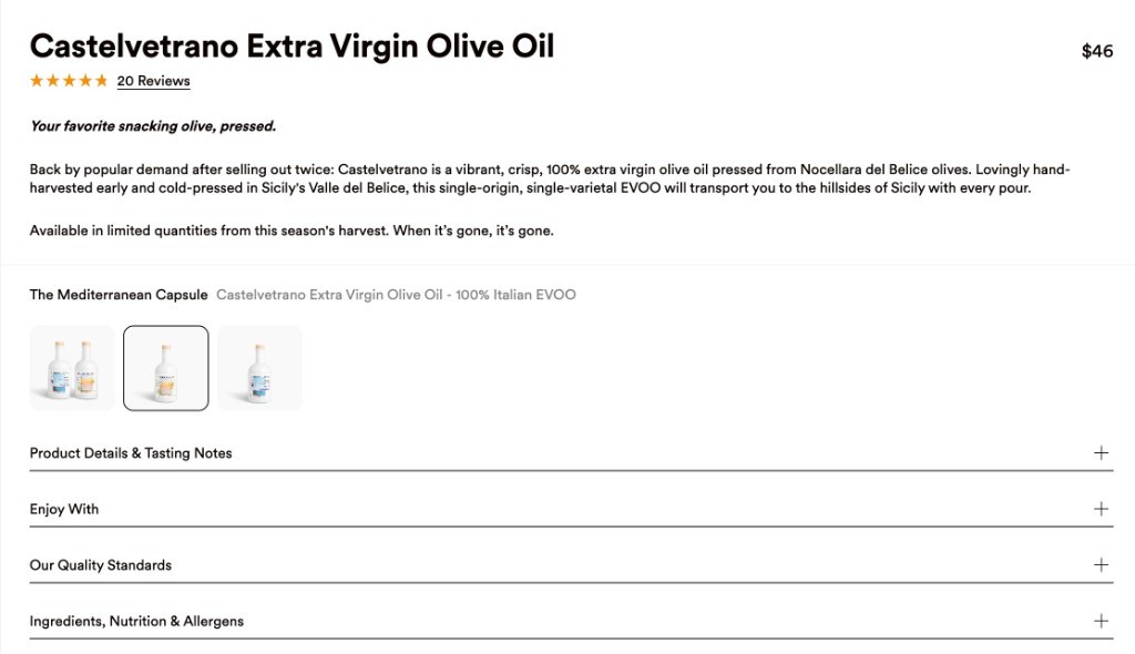
Brightland does not try to explain everything on one screen. Product descriptions stay short. Often five sentences or fewer. Each sentence makes a clear point. No filler, no stacked adjectives.
In the age of both Search and AI discovery optimization, many brands are overloading their product pages with copy to drive indexing, discovery and ranking. The challenge is.. no one wants to read all of that.. and it often fuels high bounce rates for potential customers with dwindling attention.
Brightland's PDP strategy is intentionally in opposition to that tactic. For example, the Kalamata Extra Virgin Olive Oil description communicates exactly what makes the product special: it is a full-bodied, 100% extra virgin olive oil made from early hand-harvested Kalamata olives and cold-pressed in the Peloponnese, Greece. It conveys the product's quality, origin, and limited availability without overexplaining.
Typography and spacing do the rest. Large product imagery, generous white space, and straightforward headings let the page breathe. More copy is not always more clarity.
Pairing guides that feel useful, not like content fluff
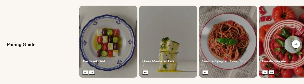
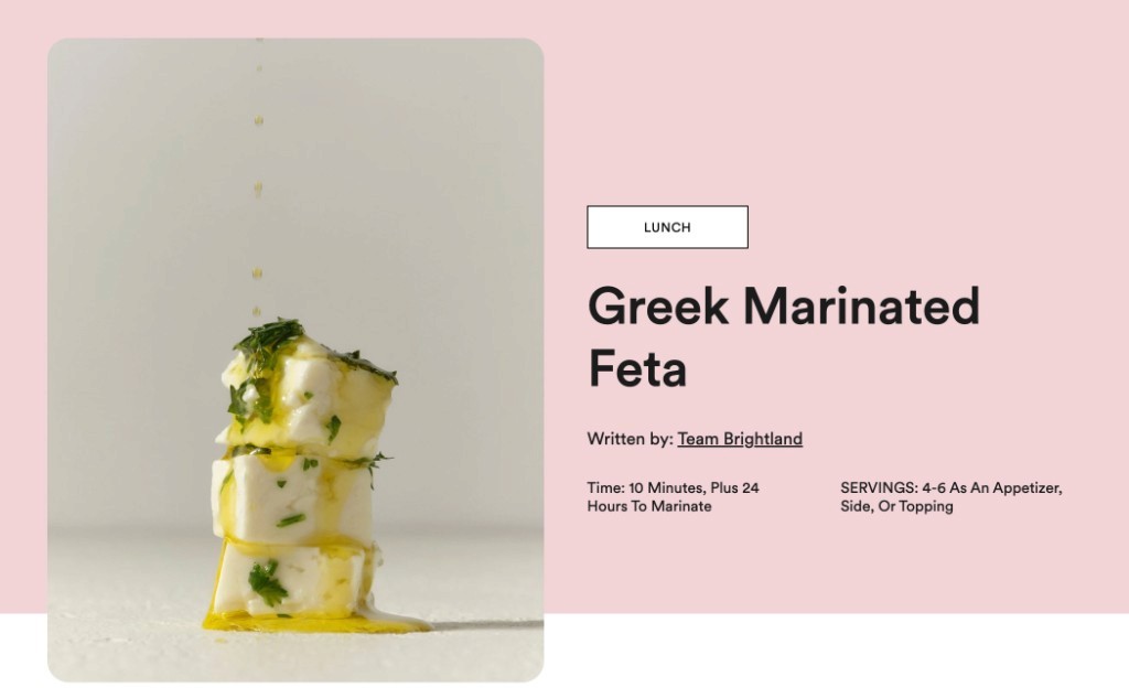

Every Brightland product ties into a pairing guide. Shoppers land on recipes that use the oil, vinegar, or honey they are considering.
Their copy strategy shows up throughout the site and comes to life again with Recipes. Recipe instructions stay simple. A two-sentence description. A short ingredient list. A few instruction steps broken into prep, marinate, and serve. No long blog preamble. No SEO padding.
The same brand that keeps ingredient labels simple and clear keeps recipe content short and sweet. The result is a resource shoppers actually use which drives brand affinity and a reason to return.
Gift collections built from the same catalog
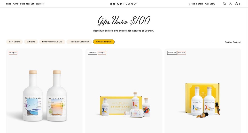
Most Shopify stores organize products by product type and stop. Brightland extends their existing catalog by assorting items in creative ways that capture various buying intents.
They run dedicated gift experiences with collection tabs: best sellers, gift sets, oils, flavor collections, and price bands like gifts under $100. The products already exist elsewhere on the site but have the opportunity to be considered in multiple ways. The gift page re-sorts them for how people actually shop: by occasion, by budget, by intent.
Brightland packaging already feels like something you would bring to a dinner party. The gift shop makes that use case explicit instead of hoping shoppers figure it out from the standard catalog.
How you can apply this to your Shopify site
Whether you sell food, beauty, home goods, or accessories, Brightland offers a repeatable playbook:
Make your welcome offer ask something useful. Pair the discount with a question that reveals taste, priorities, or use case.
Match photography to packaging. If the unboxing experience is premium, the PDP and collection imagery should be too.
Write less, mean more. Short, definitive product copy often converts better than long explanations.
Publish recipes or guides that shorten the path to usage. Show the product in context, not in theory.
Merchandise by occasion, not only by category. Gift, starter sets, and price-tier collections help shoppers who already know why they are buying.