Insights
Name the category before you sell the offer: What Vyve's homepage rebuild got right
For brands winning new customers with a small catalog, introduce the product before the offer. Niche categories need context before a discount converts. When packaging leads with the brand, the homepage is where you can name the product and help shoppers choose.


For brands trying to win new customers, especially with fewer than five SKUs, the homepage has one job before promotion: introduce the product. Discovery comes first. The offer comes after shoppers understand what you sell, why it is different, and which option fits them.
That is hardest in niche categories. Mushroom coffee is still unfamiliar to many buyers. A welcome kit can read like a generic supplement deal unless the page first names the category, explains the ritual, and helps shoppers compare flavors. That is a common tension for growing brands. Packaging often leads with the name you are building. The product type can read smaller. Flavor differences may show up more in color and design than in plain language. For first-time visitors, the homepage is where that story can be told clearly, so the offer lands with context.
Vyve is a useful example of this pattern on a live Shopify storefront. The sections below break down the homepage shifts that help a small-catalog brand tell the story before asking for the subscription.
A hero that makes mushroom coffee clear upfront
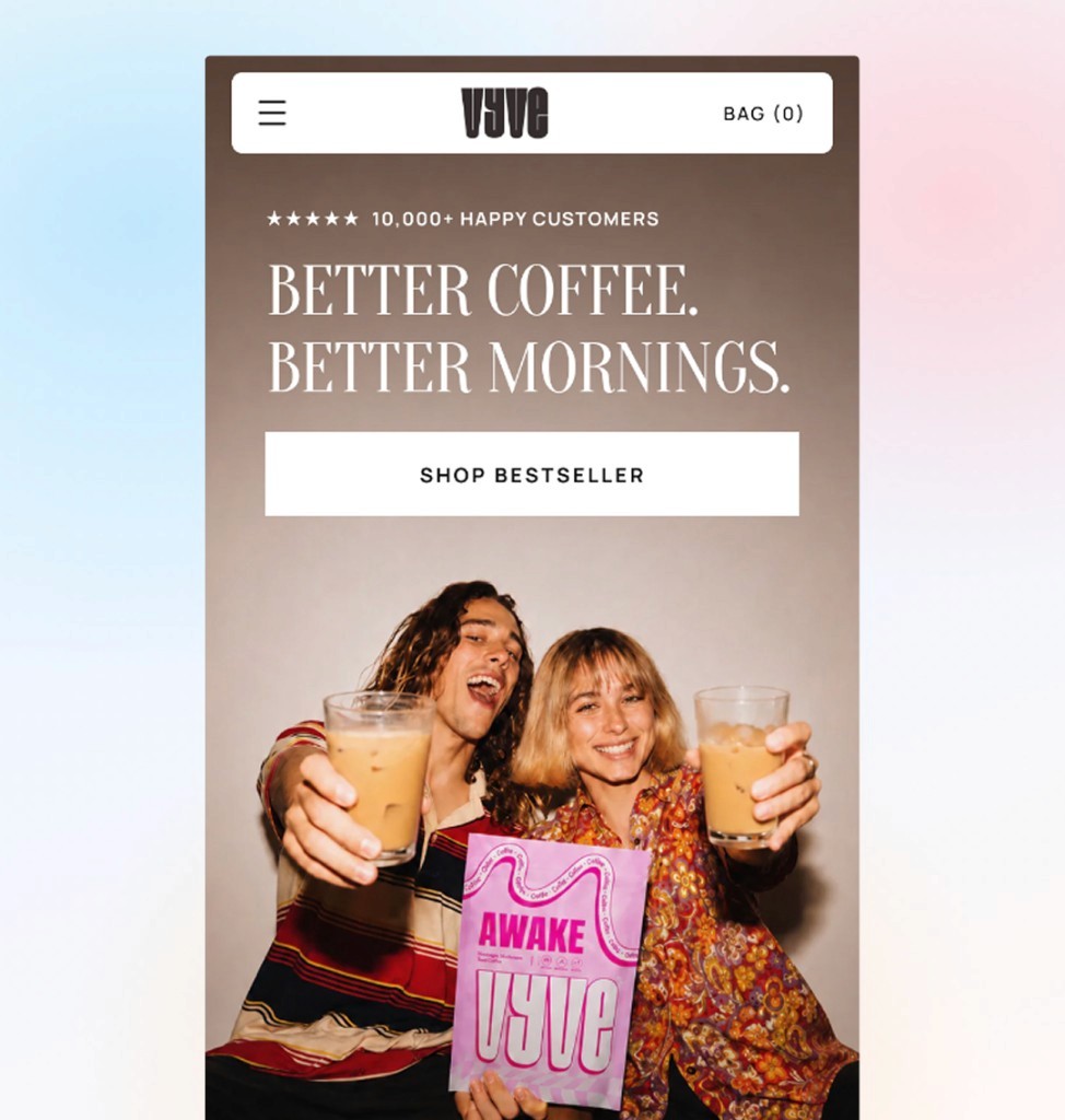
The stronger pattern leads with a hero that names the category and the outcome in one glance: better coffee, better mornings, without the crash. Lifestyle creative carries the brand. Social proof sits above the fold with 10,000+ happy customers and a clear rating. Two tap-friendly CTAs split intent between bestseller and full shop browse.
Mushroom coffee is still a new category for many shoppers. Making it explicit in the headline removes guesswork. Visitors know they are not landing on a generic supplement page or a standard coffee subscription. They are exploring a functional morning ritual.
Find your perfect daily ritual
Below the hero, Find your perfect daily ritual introduces each SKU with its own dedicated card so shoppers compare Awake blends, flavors, and bundles in one scroll. Mocha, Salted Caramel, and Starter Kit each get lifestyle photography, badge callouts, strikethrough pricing, and star ratings side by side.
That layout gives every product room to sell itself. For small catalogs, this matters even more. Shoppers who arrive unsure which flavor fits them can browse before they commit. Discovery before commitment is the whole point of a homepage that earns attention first.
Visual ingredient education with no clicks required
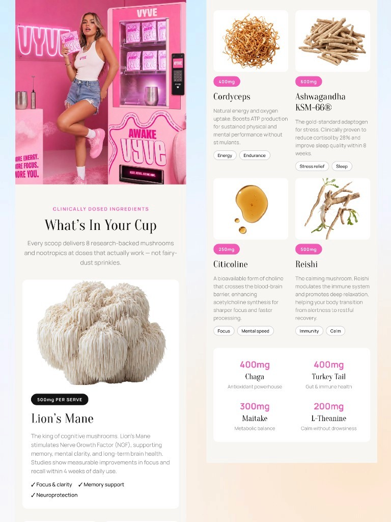
The ingredient section works best when it is fully visual with no clicks required. Lion's Mane gets a featured spotlight with dose callouts and benefit tags. Cordyceps, Ashwagandha KSM-66®, Citicoline, and Reishi follow in a grid with rich imagery, milligram badges, and chips for energy, focus, stress relief, and calm.
On many landing pages in this category, ingredients live behind tabs and accordion rows. Shoppers have to hunt for what is in the cup. Product education should happen as they scroll. Every scoop's research-backed stack should be visible without opening a modal or expanding a row.
Editorial voice between education and proof
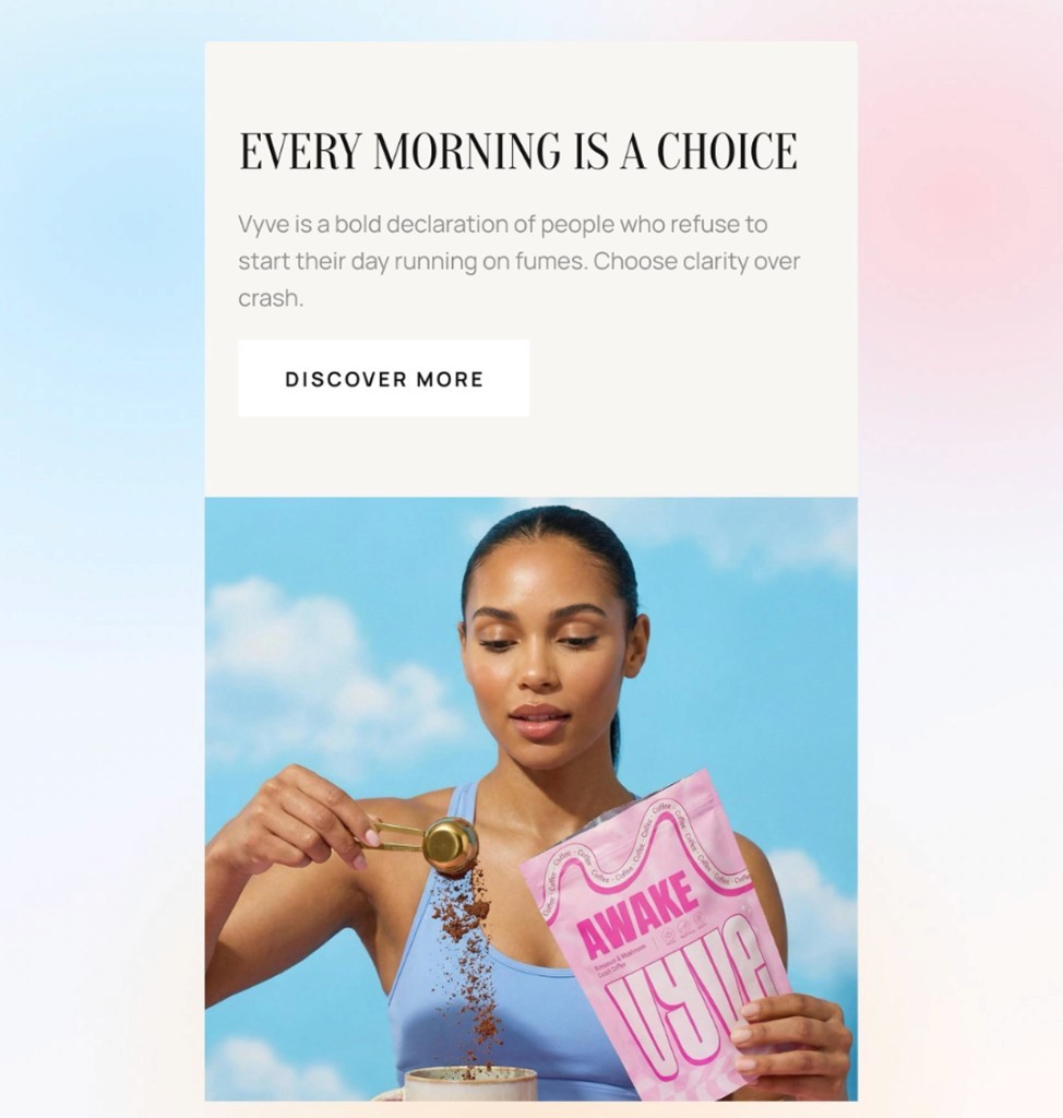
Every morning is a choice adds editorial weight between the formula breakdown and the social proof layer. A split layout pairs manifesto copy with studio photography so the brand feels premium, not promotional. A discover-more path keeps researchers moving without pushing them straight back to the buy box.
That beat matters for a category still building mainstream awareness. Vyve is not just selling a discount bundle. It is selling a daily ritual with a point of view.
Customer proof that goes deeper than a one-line quote
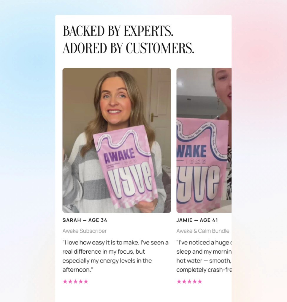
Customer proof lands best when UGC goes deeper than a one-line quote. Each testimonial carries age, the product or subscription purchased, and a fuller pull quote on taste, focus, energy, and daily use. That detail helps new shoppers see themselves in the story and understand what they are actually buying.
Trust stacks through the rest of the page. Expert and customer social proof sit together. A 30-day results grid puts focus, energy, and review volume in one glance. Press coverage from The Times, Vogue, Men's Health, and Evening Standard closes the loop. Blog cards at the bottom keep researchers scrolling when they are not ready to buy on the first visit.
How you can apply this to your Shopify homepage
Whether you sell functional beverages, beauty, or wellness, this pattern is repeatable for small-catalog brands:
Name the category in the hero. Do not assume new visitors know what you sell. State the product type and the outcome together.
Give each SKU its own moment. A product mosaic beats a single default variant when shoppers need to compare flavors, formats, or bundles.
Make ingredients visible. Dose callouts, imagery, and benefit tags in the scroll beat hidden tabs for first-time buyers.
Enrich testimonials. Age, purchase context, and a real quote help prospects self-select faster than a carousel of stars alone.
Stack proof before the FAQ. Stats, press, and editorial content handle skepticism as shoppers move down the page, not only at the bottom.